The task
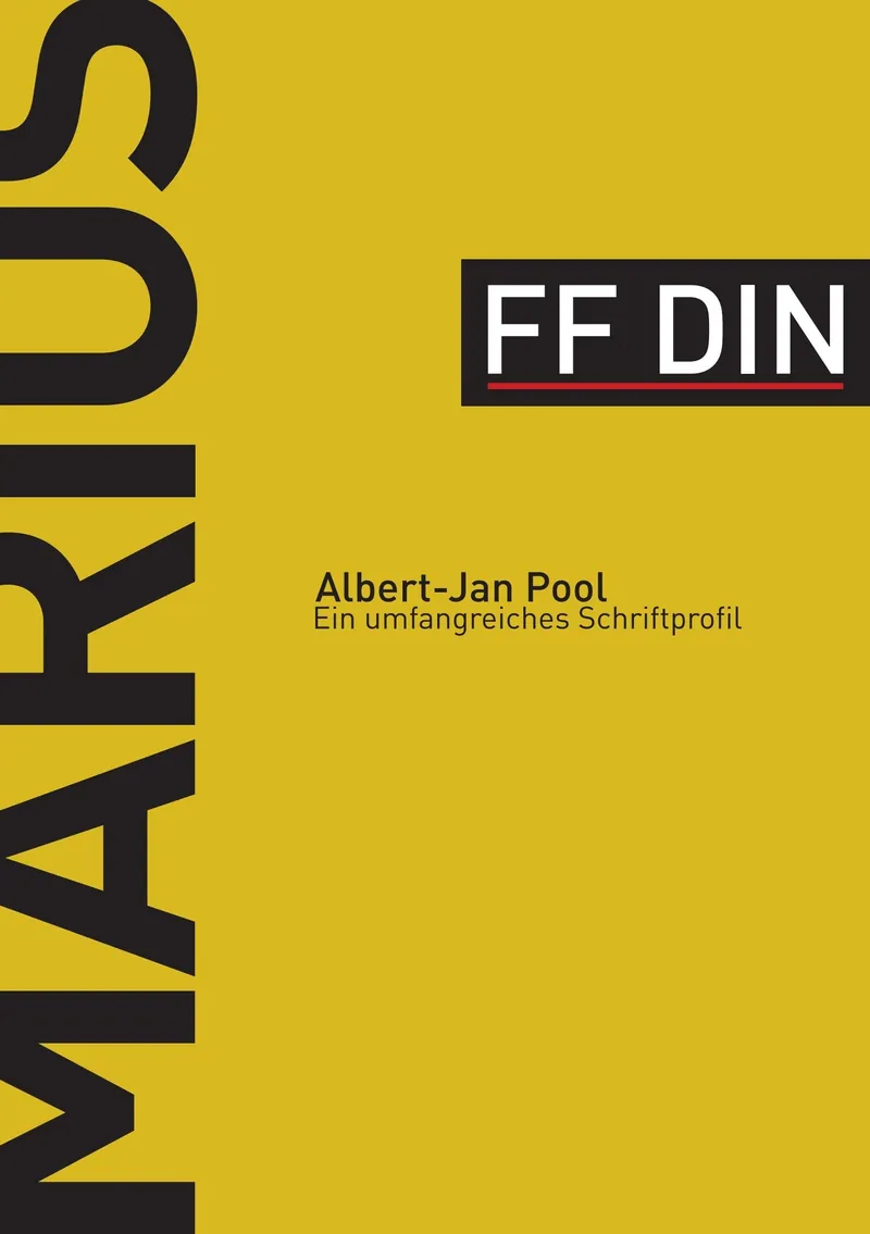
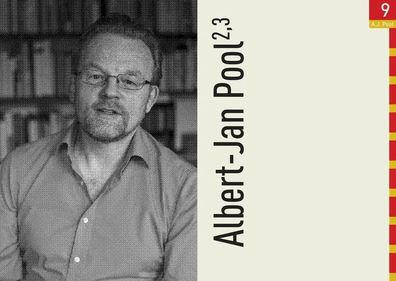
The brief was a full type profile: choose a typeface, research it, analyse it and present it as a booklet. I chose FF DIN, which I'd already used as the house typeface for my jewellery label aruz. Its story starts with a taxi ride, when Erik Spiekermann encouraged Albert-Jan Pool to rethink DIN 1451, the rigid standard lettering of German road signs and technical labels.
Idea & approach
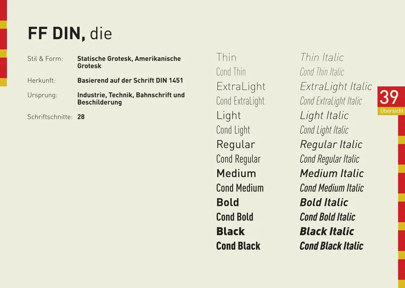
DIN is the German standard for everything measurable, so I looked for an equally German reference for the design and found it in the Duden. The booklet borrows its look: Duden red and yellow in exact colour values, chapter tabs running down the edge like a thumb index, and the page number always in the same place. The two fit together naturally, because both are about order, rules and clarity.
Process
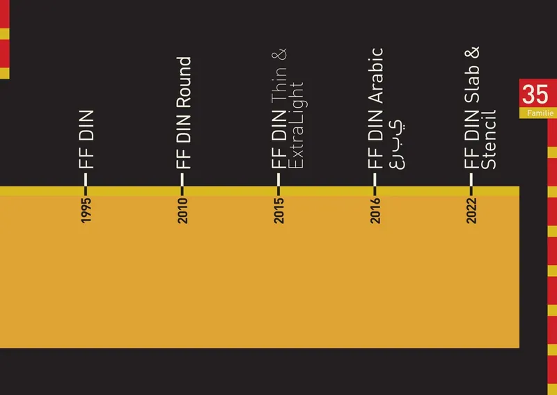
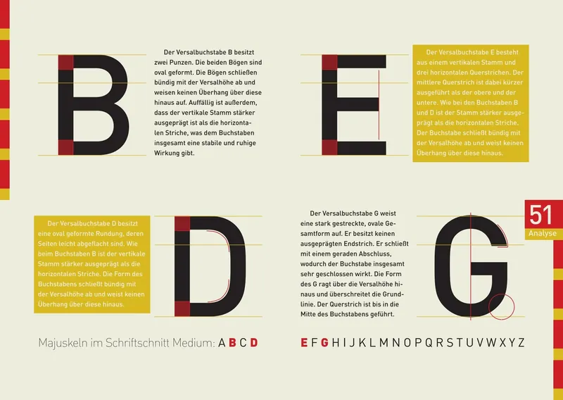
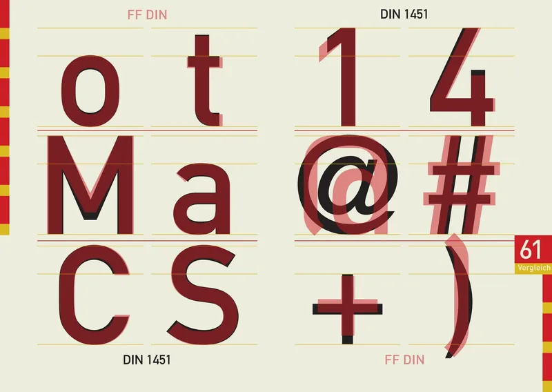
The booklet moves from Albert-Jan Pool's career and timeline through the history and growth of the type family to a letter-by-letter analysis and a direct comparison with DIN 1451 Mittelschrift and Engschrift. I gave the portraits and archive images a halftone screen in Photoshop, so they belong to the same printed, reference-book world as the type.
Result & learning
The Duden idea was my first, and it held up all the way through. Analysing a typeface down to the angle of the Q's tail changed how I look at type: FF DIN seems purely technical, but it's full of optical corrections that make it feel calm and human. And I learned that one strong reference can carry an entire editorial system.