The task
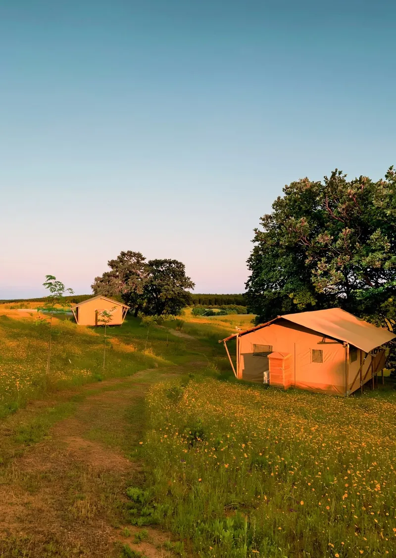
Podere Angiotto is a family-run glamping site and farm in the Tuscan Maremma: canvas lodges among old oaks and olive groves, with farm-to-table food. After the pandemic, the family left their gym behind and built it from scratch, putting their time into the place and their guests rather than their brand. The old logo and website didn't reflect any of that. A friend from uni had studied with the family's daughter in Maastricht, so our group took them on as a real client in a university project and created a full identity for them as a gift.
Idea & approach
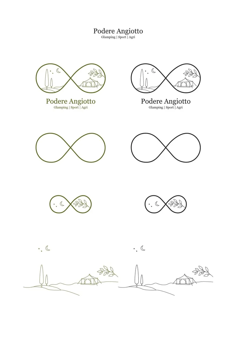
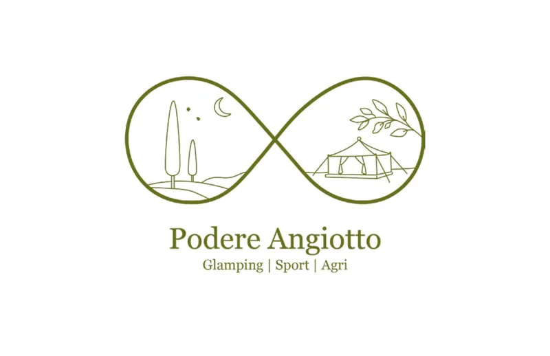
The name itself holds the story: it combines syllables from the names of the two children with otto, Italian for eight, after the parents' anniversary. Turned on its side, the eight becomes an infinity sign, which in Italy also stands for an embrace. In my logo it doubles as a pair of binoculars, so you look through it into the landscape: Tuscan hills and cypresses under a crescent moon on one side, a glamping tent and an olive branch on the other. Around it, I built a muted olive tone I named Angiotto Green, a warm paper white, Georgia Pro for quiet elegance and a handwritten script for the family's names.
Process
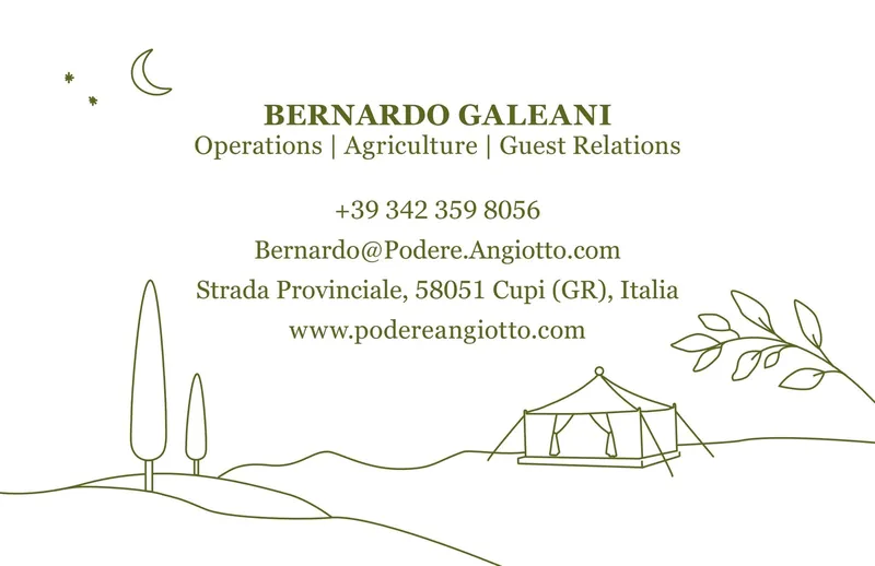
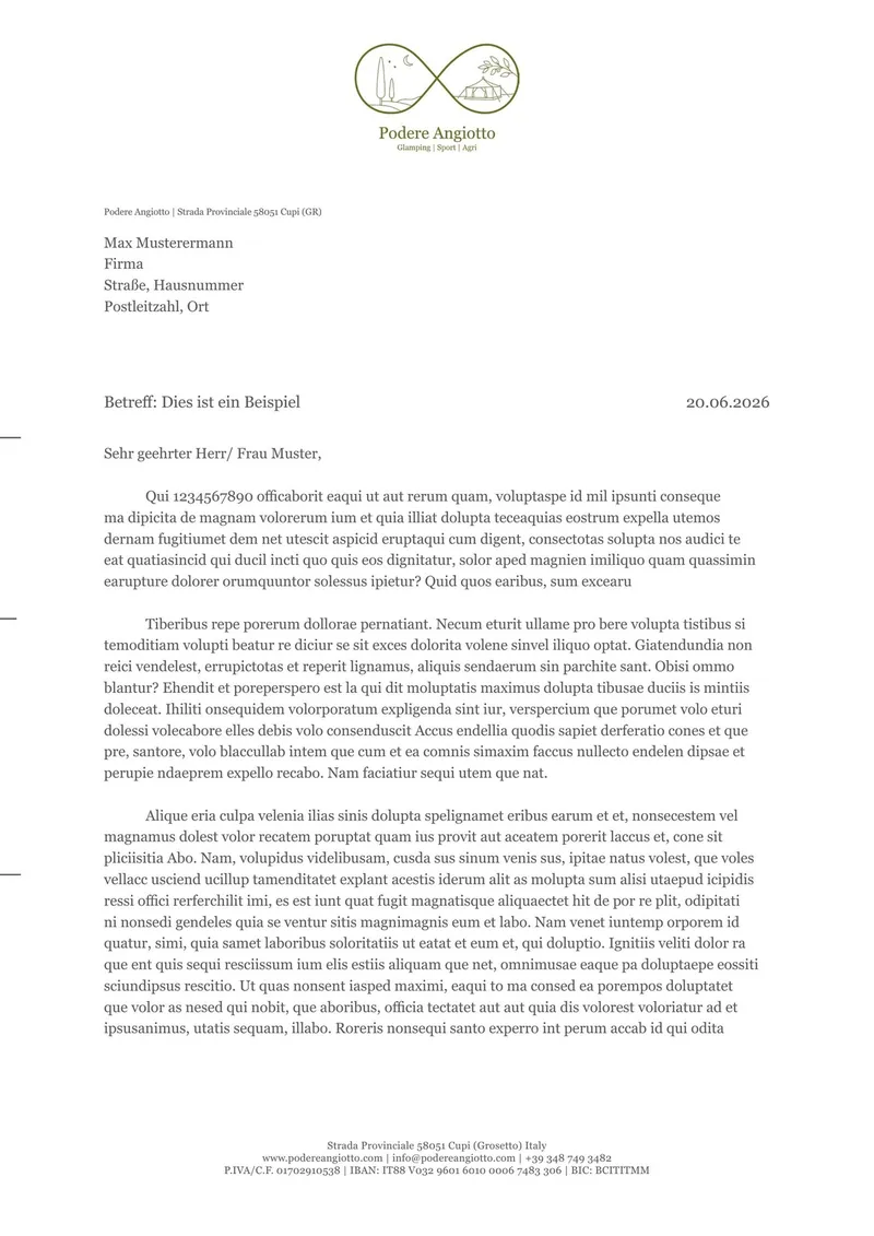
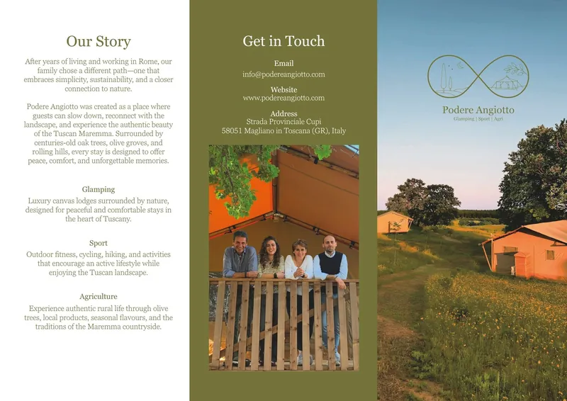
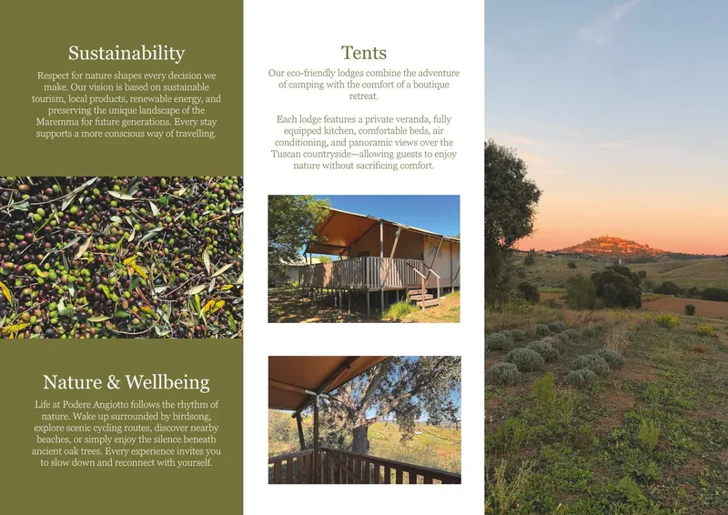
It was a long process of briefings, questionnaires and design directions. My first logos were inspired by copper engravings. They suited the place but fell apart when scaled down: fine lines broke and tight hatching closed up. So I rebuilt the mark in a monoline style on a geometric grid that stays crisp even at 15 mm wide. The same rigour runs through the rest: a 25 mm grid for the letterhead, a business card that breaks the logo down to just the hills, and a six-page wrap-fold flyer.
Result & learning
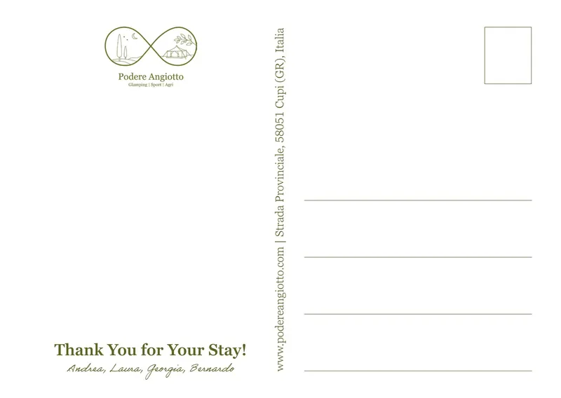
The family now has a complete identity, including a thank-you postcard that guests receive on their last day and can send home. Its front changes with the seasons or the harvest, the back stays the same. We're now building their website, and I'm optimising the logo for screens. The biggest lesson: corporate design is less about taste than about process, and clear rules don't limit creativity, they give it a foundation.